indyRIOT
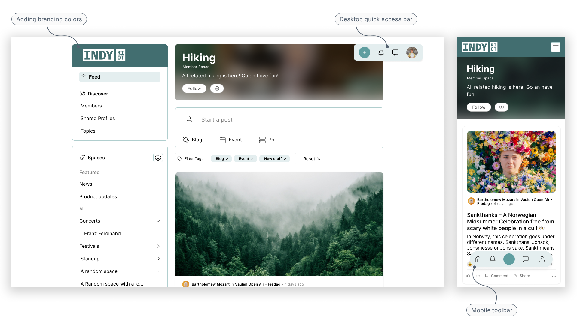
Engaging Navigation
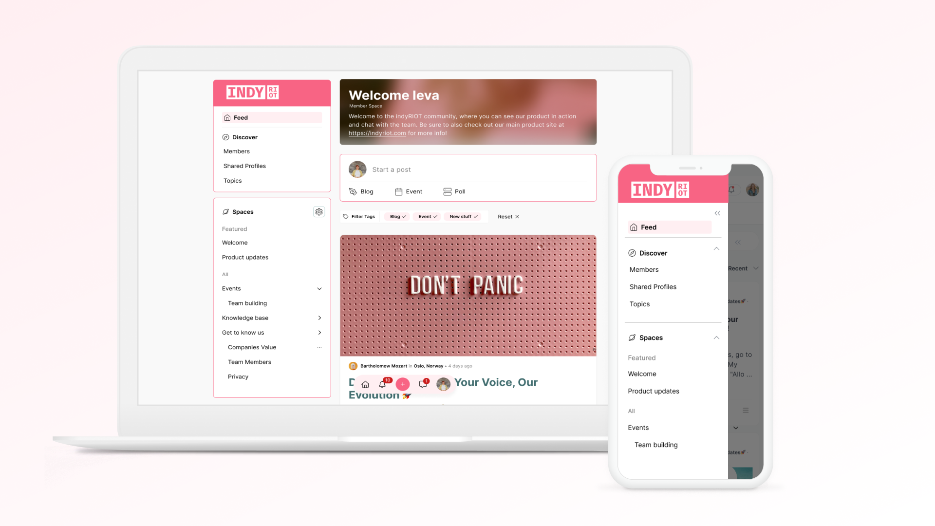
White label Community platform in Norway rethinks whole navigation experience to empower users to engage.
Role
Product Designer
Company
indyRIOT offers a turnkey Community and Networking Solution that provides complete functionality out-of-the-box. It is white-labeled software as a service (SaaS) that enables clients to fast launch their own fully branded, independent community. Company is located in Norway.
Duration
Jan 2022 - Aug 2023
Team
VP of Product, Engineers, Sales
Deliverables
Competitive
Research
Wireframes
Components
Specs
Prototype
User Testing
Background
During the project, senior management made the strategic decision to
revamp the product, aligning it more closely with customer needs and
business objectives. Over the course of one year, the product
underwent a transformation, transitioning from a traditional website
building platform to a new, faster solution capable of delivering
advanced features.
Throughout this period, I played a key role in the transition
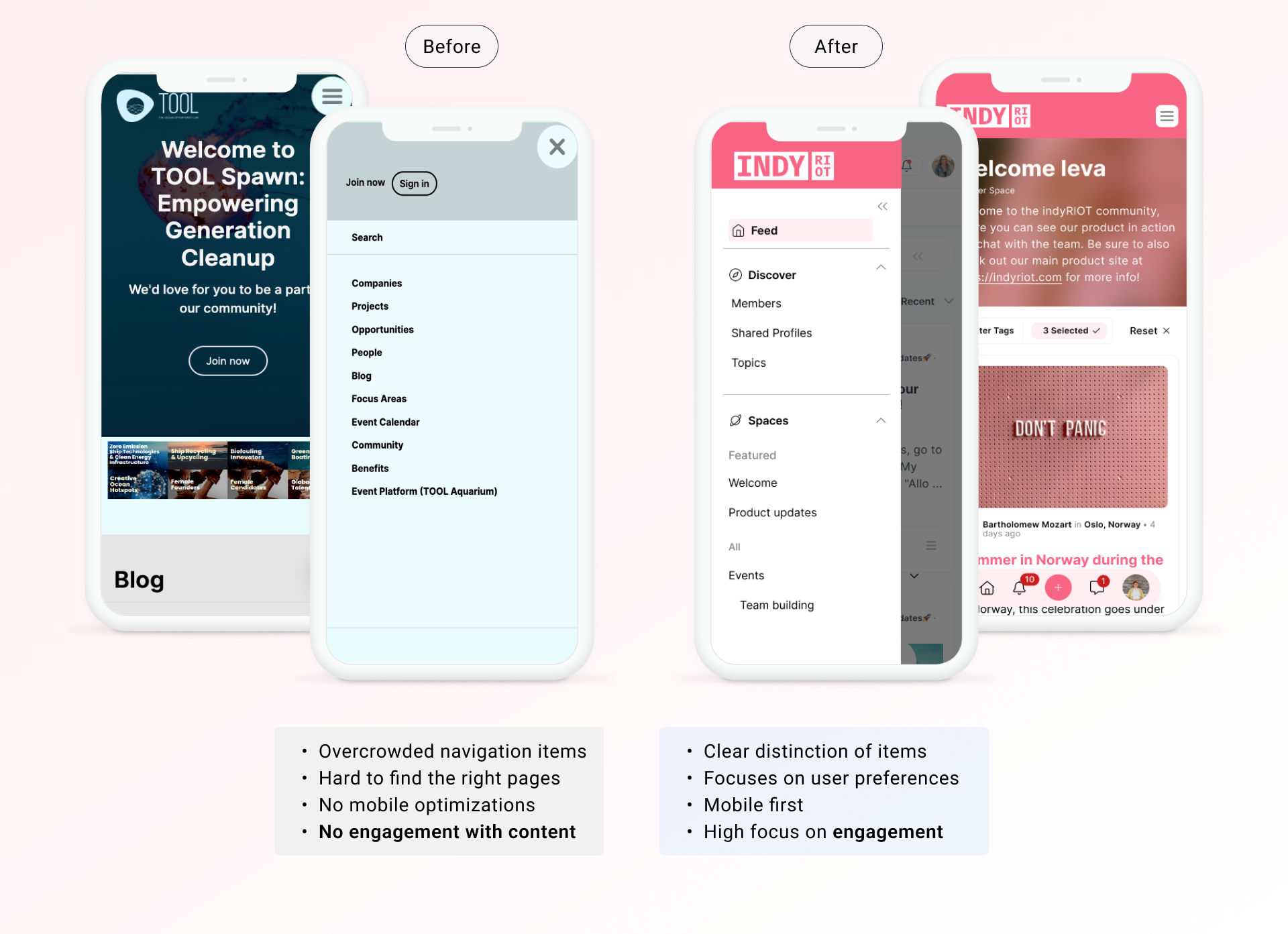
process, successfully implementing a completely new look and
navigation system within a few months, all while ensuring continuity
for existing clients on the "old" platform.
Where do we start?
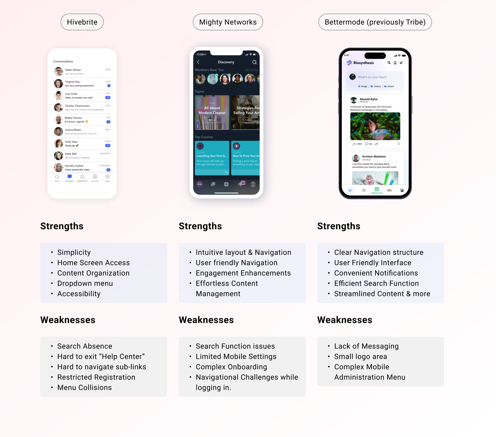
In switching from our current website platform, we found that users are craving more interaction with content and the community. Our previous platform lacked engagement, making it difficult to update and add new features. Before diving into designing a new navigation structure, we decided to quickly compare with our competitors.
Hight priority items:
User side navigation:
- Profile
- User Settings
- Posting Posts
- Notifications
Managment side navigation:
- Profile
- User and Website Settings
- Posting and Space Creation
- Notifications
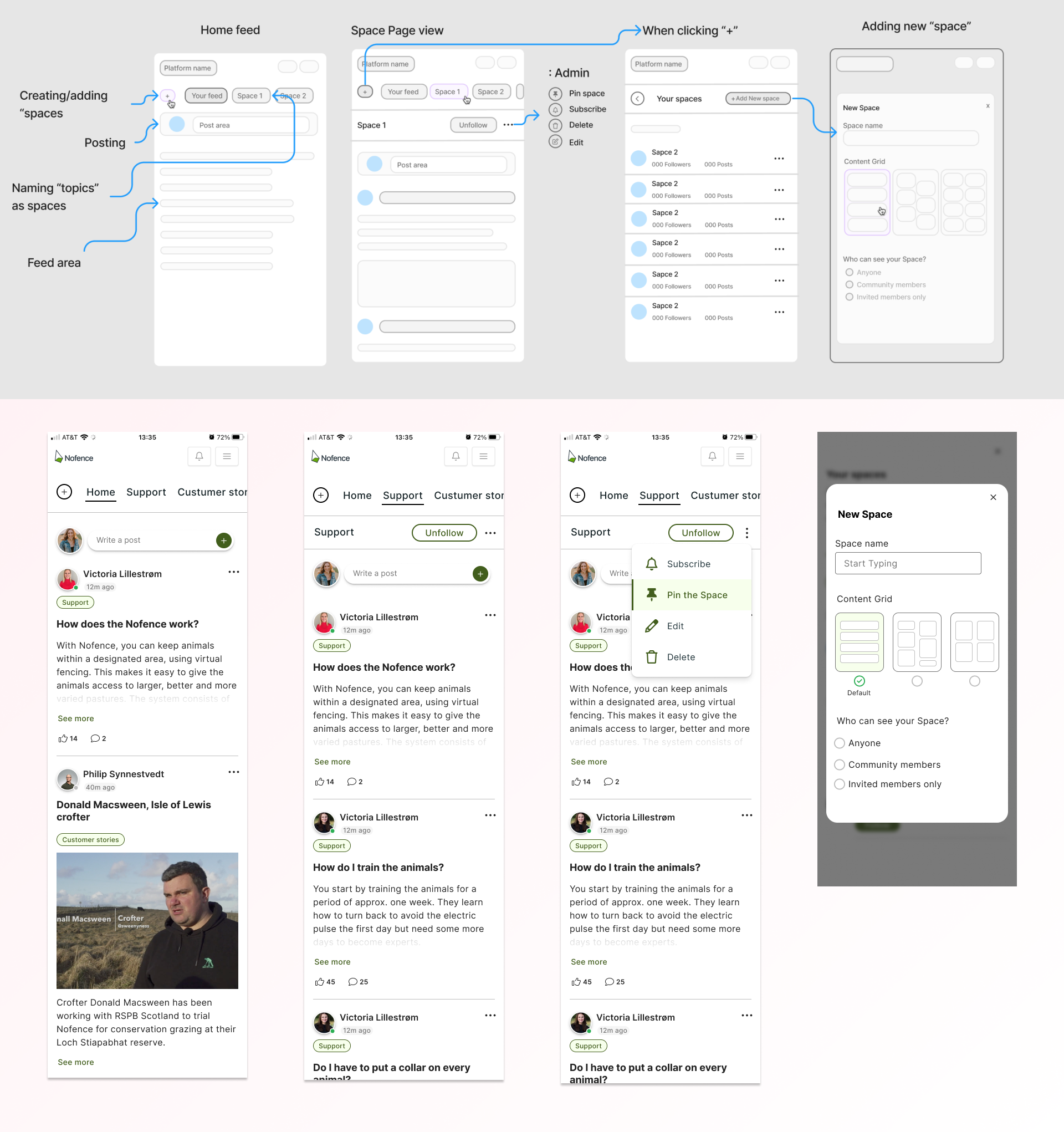
Quick iterations and fast releases
Due to frequent releases, often several times a week or even
multiple times a day, we had limited time for documentation.
However, we maintained regular communication with management to
prioritize design tasks.
Weekly calls with users allowed us to iterate and gather feedback
efficiently. Our development process relied on React and Tailwind
to build components and achieve a platform appearance that users
found familiar and comfortable.
First releases and feedback
After our initial releases and gathering user feedback, we crafted the following problem hypothesis:
If we offer an efficient and intuitive navigation, users will find it easier to accomplish their goals, discover value in the product, and develop a habit of using it to interact with others, find engaging content, and share their own knowledge.
Moreover, if customers can organize their content and activities intuitively, meeting their needs for flexibility and structure, they will communicate more effectively within their community, manage conversations adeptly, and boost engagement within their community.
Why did users still not engage with the content?
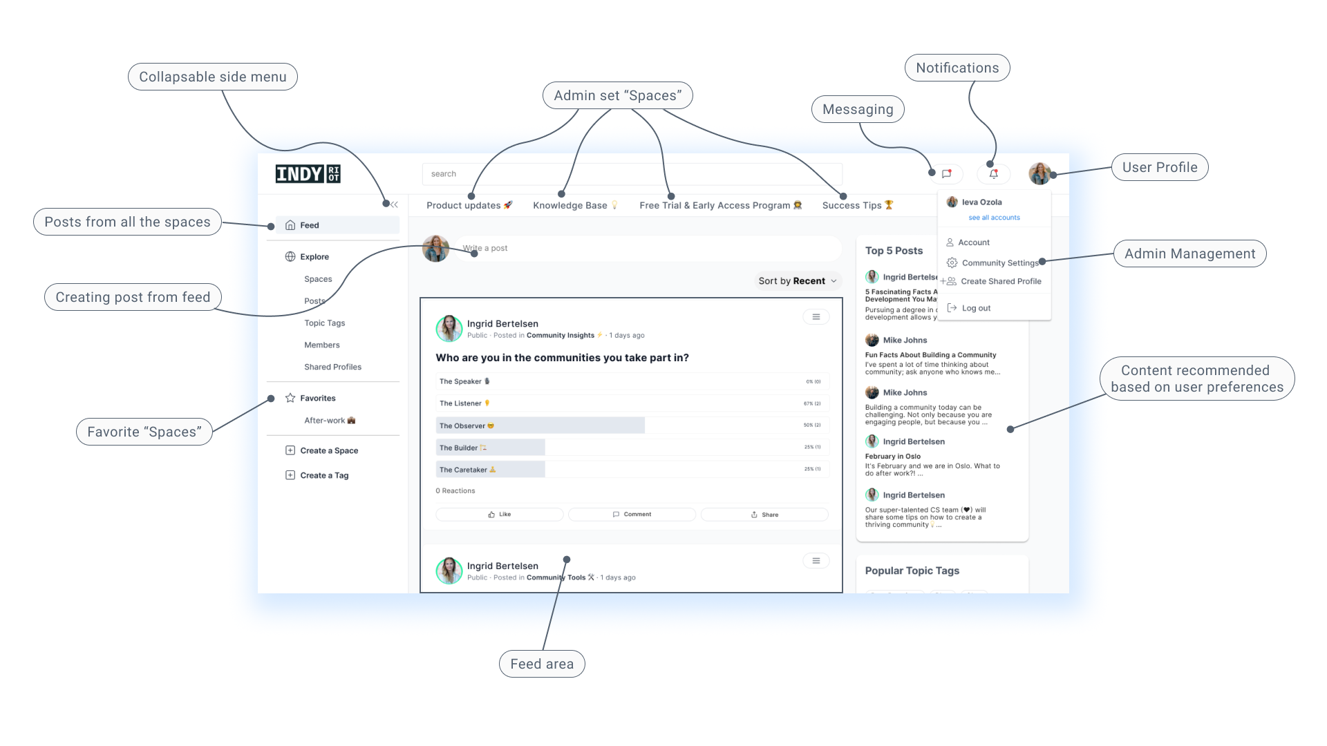
Customers have diverse organizational structures and content needs, along with varying terminology. The concept of "Spaces" provides a scalable solution for each customer to create a structure tailored to their content and conversation organization. Users can opt to follow "Spaces" based on their interests, necessitating navigation that accommodates exploration of numerous spaces, some to follow.
Alongside Spaces, we have Global Features, integral to all communities, which must be included in the navigation for the community to function effectively.
Customers who were invested in the initial product desired the same features, including the ability to reorganize pages and navigation structures and to brand the community to reflect their unique style.
Implementing guided onboarding to clarify terminology and facilitate connections with individuals they may already know from their business (company or organization) (part of another project I worked on).
Importance of Mobile Optimization
During user interviews, including in-person, online, and guerrilla
testing among students in Oslo, we found that the majority of
users preferred mobile-first usage. Only management and community
administrators, who set up and monitor the community, preferred
desktop.
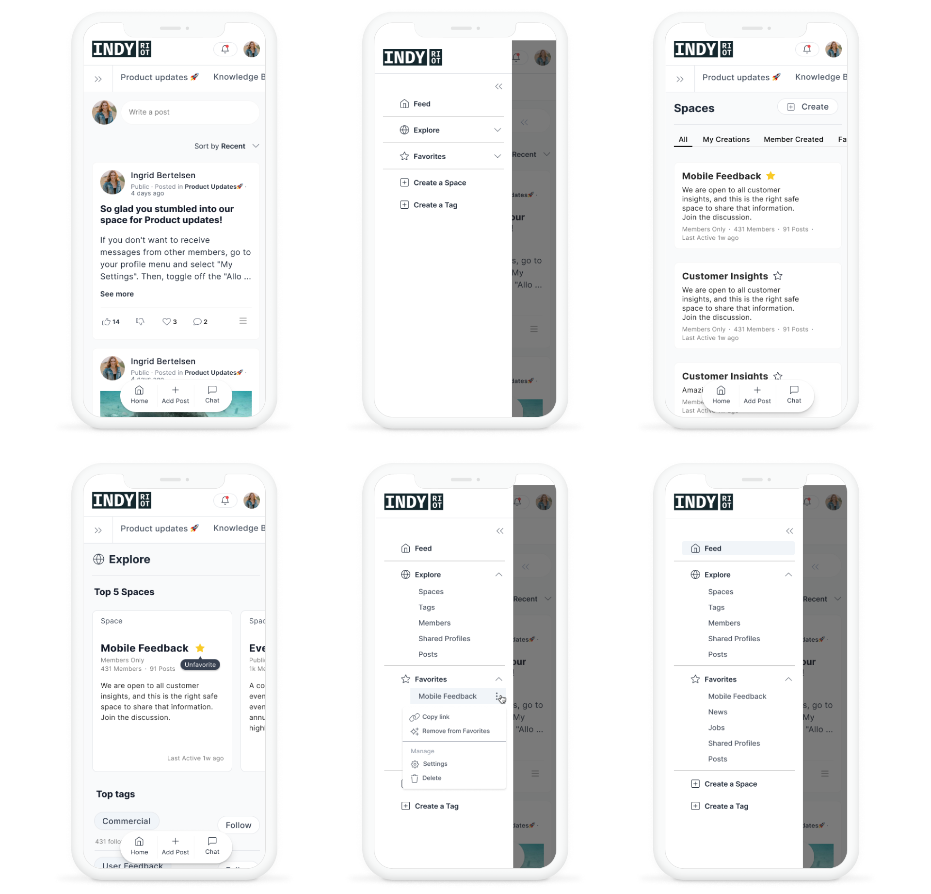
We quickly realized the importance of prioritizing
mobile accessibility as a digital product, given the widespread
use of smartphones and tablets. Without it, users may encounter
difficulties accessing or navigating the product on smaller
screens, leading to a subpar user experience and potential loss of
engagement.
Final Deliverables
Towards the end of my tenure, there were shifts in management and evolving priorities, impacting the final outcome of the product. During the project's concluding phase, disagreements across departments arose concerning navigation and its components. Unfortunately, my proposed design and user preferences were not upheld.
